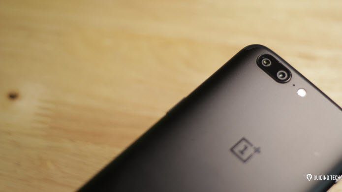
On the other hand, OxygenOS from OnePlus often gets lauded as one of the best custom UI experiences. And it keeps getting better with each successive update. So, how do the two compare? Well, that’s exactly what we’re here to find out. Before we get to it, let me give you a brief overview of the devices I’ll be using for this comparison: In the red corner, we have the OnePlus 6T, packing in a Snapdragon 845, 8GB of RAM, and running OxygenOS v9.0.12 based on Android 9.0 Pie. While in the blue corner, we have the Galaxy S10 Plus, featuring the latest Snapdragon 855, 8GB of RAM, and running One UI 1.1 version released recently. Now let’s get to it.
Design
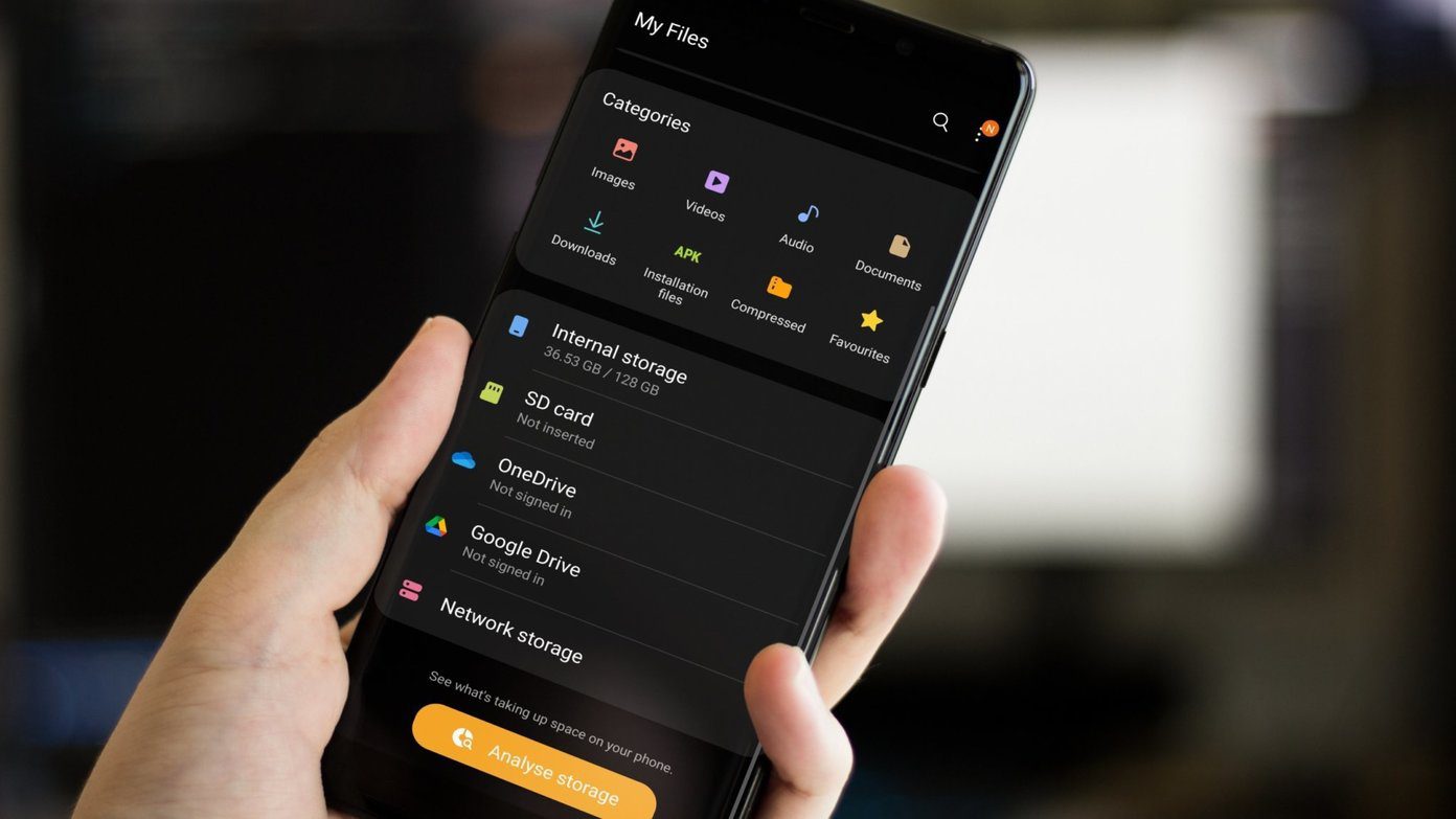
Samsung’s Android skins have always been far from the stock Android look. And One UI is no different. However, it’s much more pleasant to the eyes. The overall design appears quite refined, and Samsung has made some great decisions to improve the user experience. All elements have been moved closer to the chin to make one-handed use easier. Samsung updated most icons, and the general design language is precisely what you’d expect to see in a modern smartphone. But some aspects of Samsung’s customizations might seem a bit overwhelming to the first time adopters and new users who’re moving from simpler phones. Take the settings menu for example. Sure, Samsung did move things around to make it easier to use, but if you don’t use the Search, you might face trouble locating a particular setting. In contrast, OxygenOS is quite close to the stock Settings menu and is a familiar space for most users. That’s why finding any setting shouldn’t be all that difficult. With OxygenOS, you can easily tell that you’re looking at a skinned version of Android and that’s not entirely a bad thing. Everything looks clean and minimal. And no matter which phone you’re coming from, OxygenOS will make you feel right at home. Getting the hang of it is far simpler than getting accustomed to all of One UI’s quirks. At least, in my opinion. Most OnePlus users widely appreciate the minimal aesthetic and ease-of-use. But I may be a bit biased here. So, to keep a level playing field, I’ll call it a draw. OxygenOS: 1 One UI: 1
Performance
While some might prefer Samsung’s design approach, I’m confident that OnePlus has the Korean giant beat when it comes to performance. OxygenOS is smoother than a baby’s bottom, and One UI feels like a 5 o’ clock shadow in comparison. I don’t know if it’s the transitions or its optimizations, OxygenOS feels leagues ahead. Launching apps, multitasking, taking photos, or anything for that matter, feels a whole lot more fluid on a OnePlus device. That’s quite impressive when you account for the fact that it’s using an older processor. Keeping Samsung’s history in mind, I can’t be sure if the Galaxy will be able to match up to its performance a couple of months down the line. Battery optimization is the only thing that seems to be an issue for OnePlus users. It’s not that OnePlus devices don’t deliver great battery life. On the contrary, battery optimization is so aggressive that it kills background processes (including whitelisted ones) a bit too indiscriminately. Check our guide to extend battery life of OnePlus 6 if you own one. A lot of users have mentioned that they’ve missed important notifications after leaving their phone idle for a while. There’s even a website dedicated to the issue, listing all of the offending manufacturers. OnePlus takes the second spot on this list. Since this is such a widespread issue, performance of OxygenOS doesn’t really account for much. Therefore, I’ll have to call another draw. OxygenOS: 2 One UI: 2
Customization and Additional Features
What I’m about to say now might trigger some of you, but I’m going to say it anyway. Both of these skins are better than stock Android. I think all third-party skins are better than stock Android. Why? Because they let you customize your phone and bring some handy features to the table. One might argue that I can get most of the functionality with apps. But why should I have to download an app to get some basic functionality on my device? One UI is chock-full of customizations and additional features that you won’t find on a Pixel. You can alter several aspects of the UI and truly make your device your own. There are also a ton of additional features like Edge Panels, duplicate apps, one-handed mode, etc., that make life a whole lot easier. Even OxygenOS has some great customizations and features. But as you’d know, too much of anything isn’t good. And that’s exactly what differentiates OxygenOS and One UI. While both are feature-rich, OnePlus exercises the discretion to include only useful features — the ones community asked for. It’s true that One UI packs in more features between the two, but some these aren’t welcome additions. Take Bixby for example. People don’t want yet another voice assistant. The internet is rife with tutorials on how to disable Bixby, which should make the sentiment quite clear. But Samsung doesn’t seem to care. I could go on and list more such features, but you get the point. On the other hand, OnePlus closely pays attention to what the community wants. That’s the reason why OxygenOS packs in features that people use daily. Handy things like call recording, quick gestures, an app locker, etc. make OxygenOS one of the best Android skins. It’s that simple. OxygenOS clearly takes the point in this round. OxygenOS: 3 One UI: 2
Bloatware
Moving on to another issue Samsung has addressed in One UI — bloatware. Samsung still wants to fill your phone with unwanted apps. It asks you for permission to do so when you set up your new phone. If you don’t accept, One UI is relatively bloat-free. There are still a couple of pre-installed apps, including the Microsoft Office suite, but those usually come in handy for most users. Similarly, OxygenOS also doesn’t include a whole lot of bloat. It packs just a couple of e-commerce and social apps, which can be uninstalled quite easily. However, it’s worth noting that the Galaxy S10 comes with McAfee preinstalled. It’s conveniently hidden within the settings and you can’t remove it. I’m not sure if that is going to harm the performance, but it’s definitely not a welcome addition. That tips the scale in favor of OxygenOS yet again. OxygenOS: 4 One UI: 2
Software Updates
Let’s round things off with updates. Samsung’s track record with software updates has been quite shabby. On top of that, the company has been previously accused of throttling device performance with updates. That doesn’t really inspire confidence. Long term software updates have also been an issue, with many Samsung devices never receiving new builds of Android only a year after their release. OnePlus, on the other hand, has really stepped up its game. The company pushes security updates quite frequently and is among the first to roll out new versions of Android. What’s even better is that OnePlus pushes regular updates for old devices as well. For instance, the OnePlus 3 and 3T (its 2016 flagships) recently received a beta build of Android Pie. Another win for OxygenOS. OxygenOS: 5 One UI: 2
Did Samsung Get it Right This Time?
While Samsung did get a lot of things right with One UI, I’m afraid there’s still scope for improvement. I’m glad that the company has finally started paying heed to user feedback and the results are pretty good. But for now, OxygenOS is still the better option. And at the rate OnePlus keeps improving the software experience, Samsung might have to ramp up the One UI production drastically. Next up: Even though OnePlus’ OxygenOS is the clear winner here, One UI brings some impressive improvements to the table. You can check out these cool One UI tips to make the most out of your new Samsung phone. The above article may contain affiliate links which help support Guiding Tech. However, it does not affect our editorial integrity. The content remains unbiased and authentic.


